

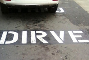
Somewhere out there, a road marking tells drivers to “DIRVE.”
It’s one of the funny signs we shared back in April, part of a collection that made us stop and look twice. Some of those signs were written to get a laugh. The ones we keep coming back to were accidents: small slip-ups that made it through writing, approval, production, and installation without anyone catching them.
On a commercial property, those mistakes aren’t nearly as entertaining. Signs are built to be noticed, so their errors are too, and they stay in place until someone pays to correct them. A misspelled tenant name on a monument sign, wayfinding signs that point visitors the wrong way, or an entrance sign leaning after a New England winter all cost money to fix. They also shape how people see a property before anyone reaches the front door.
So we revisited those accidental favorites with a professional eye. Each one points to a mistake that commercial properties can avoid with the right process.
Four Commercial Signage Mistakes Worth Learning From
1. The Typo Nobody Caught
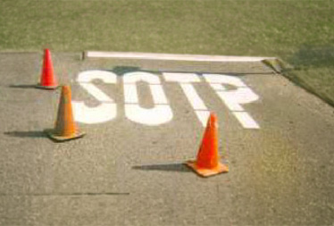
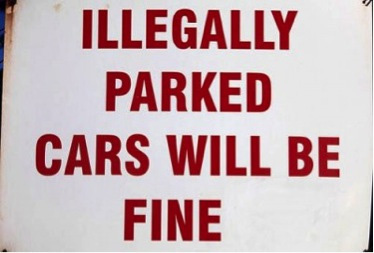
Along with “DIRVE,” our collection includes a pavement marking that reads “SOTP” and a parking sign one letter short of warning that illegally parked cars will be fined. Each made it through layout, production, and installation without anyone noticing.
On commercial projects, proofing errors are most expensive when they’re discovered after fabrication. Printed faces, replaceable panels, and vinyl graphics can often be corrected. Fabricated channel letters and dimensional elements may need to be partially or fully remade, adding material costs, a new spot in the production schedule, and another trip to the site.
A dependable proofing process includes:
- Checking every business name, suite number, phone number, and address against a confirmed source
- Having at least two people review the final proof, including someone who didn’t write the copy
- Confirming names, logos, and brand colors directly with each tenant
- Reviewing proofs at actual size whenever possible, not only on a screen
- Getting written approval before fabrication begins
A few extra minutes at the proof stage is the most affordable quality control on any sign project.
2. Signs That Send Mixed Messages
Another photo shows a “Not a Through Street” sign mounted directly above an “Evacuation Route” sign. Either one would make sense on its own, but sharing a post, they leave drivers guessing at the exact moment clear direction matters most.
On commercial properties, the same kind of confusion builds gradually. Signs get added one at a time as tenants turn over, parking is reconfigured, or new buildings open. Without a plan connecting them, messages start to overlap, compete, or contradict each other. The problem is most visible on campuses, medical properties, and multi-tenant developments, where visitors follow a sequence of signs to reach their destination.
For architects and developers, the most reliable prevention happens during design. A sign schedule documents every sign on a project, including its location, type, size, and message, so the full system can be reviewed as a whole while changes are still easy to make. It also gives property managers a clear reference long after opening day, keeping future updates aligned with the original plan.
For properties already in operation, keeping signage coordinated means:
- Walking the property the way a first-time visitor would, from the street entrance to the suite door
- Using consistent names and directional language from one sign to the next
- Reviewing the full system whenever tenants, parking, or site layouts change
- Removing outdated signs rather than adding new ones beside them

3. Saying More Than the Sign Needs To
Then there’s the door sign advising that if the door does not open, you should not enter. The advice is sound, though the door itself already makes that point quite effectively.
Commercial signs rarely state the obvious that plainly, but many try to say more than viewers can take in: extra taglines, long lists of services, and small type crowded onto a limited sign face. Drivers passing a pylon sign and visitors scanning a tenant directory have only moments to find what they need, and every extra word competes with the one that matters most.

4. The Sign That Couldn’t Stay Standing
Finally, there’s the warning sign that ended up toppled over in loose sand. Whatever it was meant to warn people about, it was no longer in any position to do so.
Sign failures on commercial properties are usually less dramatic, but they’re just as preventable. Shallow footings, the wrong mounting hardware, poor drainage, and years without a close look all take a toll. New England weather speeds things along with freeze-thaw cycles, heavy snow, strong winds, and summer UV exposure. The results show up as leaning posts, loose panels, faded faces, and lights that no longer work, often unnoticed until a tenant or visitor points them out.
Long-term performance starts with professional installation planned around the specific site, accounting for soil conditions, drainage, wind exposure, and nearby traffic. After that, a quick walk-through each spring and after major storms helps catch small issues before they turn into safety concerns or full replacements. When a sign does need attention, ViewPoint’s service and repair team has two dedicated service vehicles and typically responds within 72 hours of a service call.

Signs that communicate clearly tend to:
- Lead with the one piece of information people need first
- Keep copy brief enough to read in passing
- Size lettering for the real viewing distance and traffic speed
- Use contrast and spacing to make the primary message stand out
For freestanding signs along busy roads, those choices carry even more weight. Our guide to designing an eye-catching monument or pylon sign covers legibility, placement, and viewing distance in more detail.
Why Property Teams Partner with ViewPoint
Each of these mistakes traces back to a gap in the process: a proof no one checked, signs added without a plan, a message that tried to say too much, or an installation that wasn’t built for its site.
Since 1996, ViewPoint Sign & Awning has helped architects, developers, and property teams across Greater Boston and New England close those gaps, with support at every stage from initial concept to final installation:
- Design consultation
- Project management
- Permitting and compliance support
- In-house fabrication
- Professional installation
- Service and repair
Our clients range from one-of-a-kind boutique locations to Fenway Park. Explore our portfolio to see examples of our work.
Because the only double take your sign should get is an admiring one.
Planning New Signage for Your Property?
Whether you’re specifying signage for a new development or updating signs already in place, our team can help you review the message, materials, and installation plan before production begins. Request a project consultation to get started.