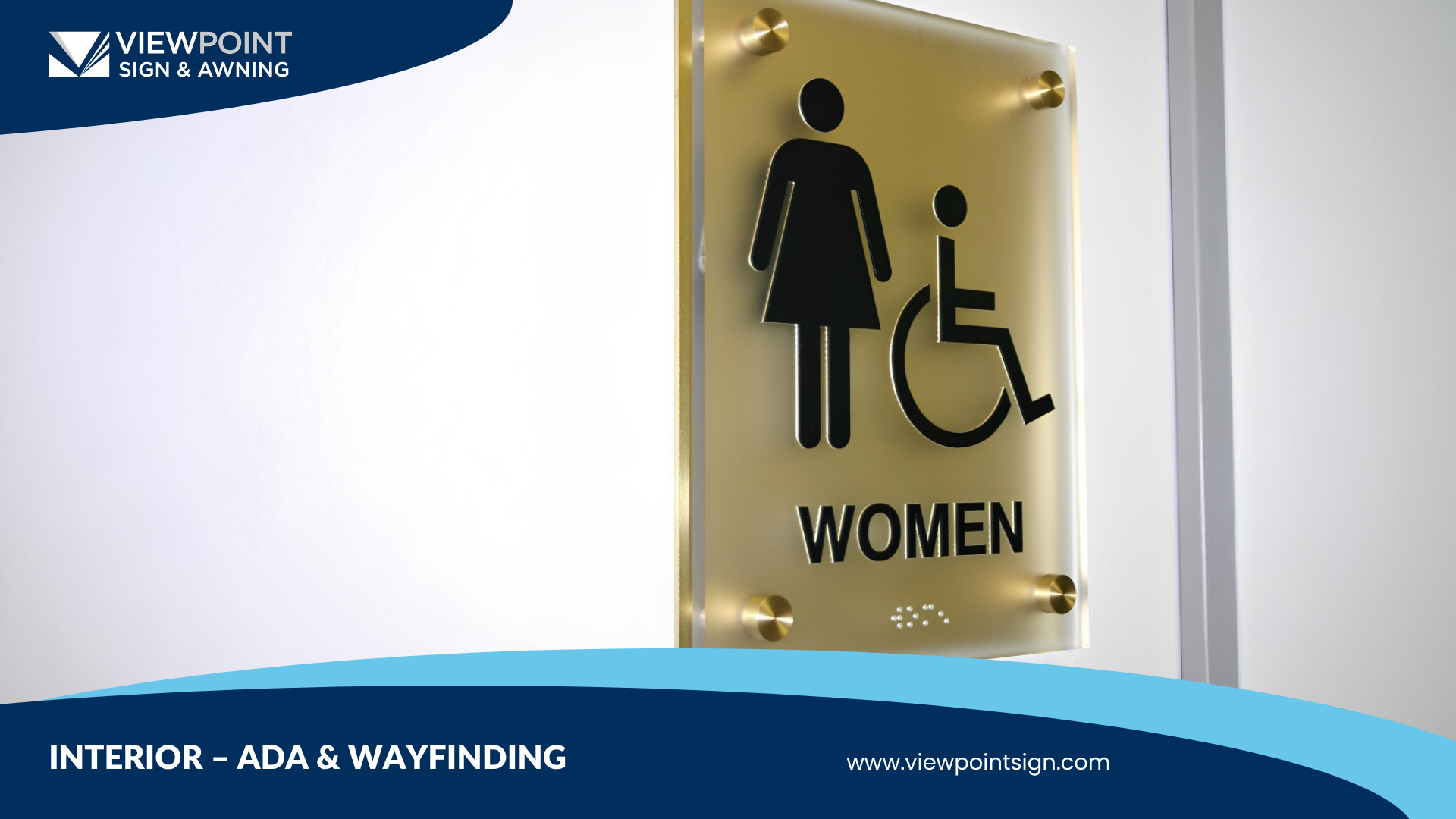
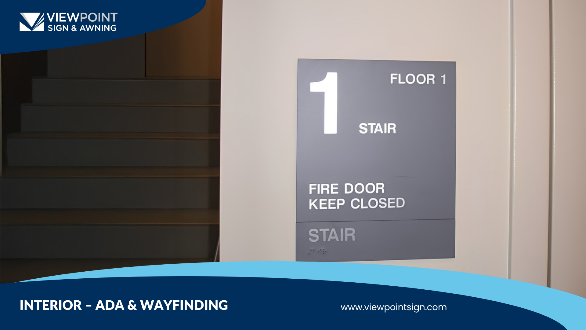
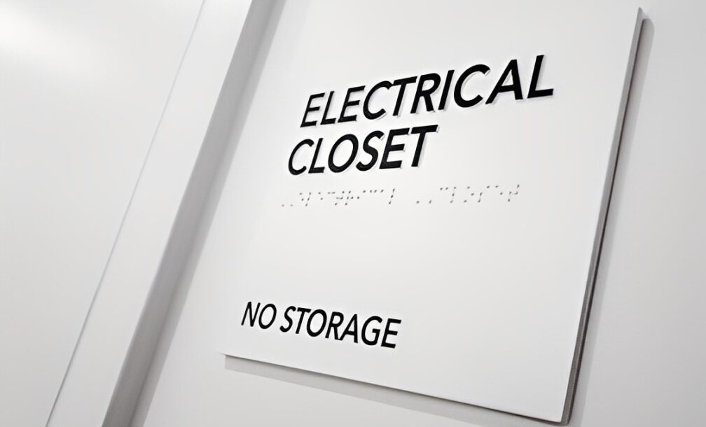
You’ve probably seen an ADA sign with Braille that looks compliant, but is it really, or just pretending? Take a closer look and you might notice:
The dots are uneven, scattered, and pretty much off balance.
Then your eyes drift to the text blending into the wall, it feels like you are almost trying to read the invisible.
And sometimes, the whole thing is mounted just a few inches too high, completely out of reach for someone in a wheelchair or anyone who actually needs to get close to read it..
The truth is, on the surface, these seem like small or even missable details for most of your customers, but they can make a big difference in how people experience your space.
Too often, businesses assume ADA compliance just means “adding Braille,” then set it and forget it. In reality, accessibility is much more nuanced. A misplaced sign, poor contrast, or incorrect font can not only confuse visitors but also put your business at risk of noncompliance.
According to the U.S. Department of Justice, ADA-related complaints have increased by more than 20% in recent years, and many of these complaints are tied to improper or incomplete signage. That means 1 in 5 people with disabilities is more likely to file a formal complaint if your interior signage isn’t properly installed from the start.
But being on the right side of legal compliance is just the first step. Once your interior ADA signs are properly installed, there are five common mistakes you’ll want to watch out for.
Why? These easily avoidable issues can cost you customers, damage your reputation, or even lead to penalties.
So, get ready to uncover the most frequent ADA signage mistakes businesses make, and, more importantly, how to avoid them.
Mistake #1: Treating ADA Compliance as an Afterthought
Imagine walking into a restaurant or convenience store, only to realize you can’t make sense of any of the signs around you.
It’s like wandering through a shop in a small town in Japan—everything written in Kanji, no English translations in sight. You spot a cozy little place that catches your eye, but once you step inside… you’re lost.
The colors don’t make sense.
You can’t tell where to go, what’s what, or even how to order.

You start to feel like an outsider, disconnected from the experience, like the space wasn’t really meant for you in the first place..
That is what 5 out of 10 people with disabilities face when accessing public spaces, according to the 2022 Canadian Survey on Disability by Statistics, from sidewalks and building entrances to simply understanding interior signs in their own communities.
But this isn’t only an accessibility issue; it’s an experience issue. When people feel uncertain or embarrassed navigating a space, they’re far less likely to return.
When you involve a professional early, every sign, not just the required ones, becomes part of a system: consistent materials, proper placement, and built-in compliance.
However, many businesses add ADA signage at the very end of a project, just to check a box before opening day or to be somewhat compliant. But accessibility shouldn’t be an afterthought; it should start at the design stage.
Because when people feel comfortable and confident moving through your space, they stay longer, enjoy what you offer, and come back again.
Mistake #2: Ignoring Contrast and Readability
Ever walked into a building where you have to squint your eyes just to understand what a sign is about? No, you don’t need new glasses or to change your contact lenses. Low contrast is one of the most common ADA mistakes businesses make, and one of the easiest to fix.
When the text and background blend together, signs become nearly impossible to read. Could you imagine reading a black font over a black wall? The ADA requires at least a 70% contrast ratio between text and background to ensure clarity. That means dark text on a light surface—or vice versa, so information stands out instantly.

A good example might be dark navy text on a brushed silver background, or white lettering on a charcoal panel.
And every sign should feature a non-glare, matte finish, so it stays legible under different lighting conditions, whether sunlight, indoor LEDs, or hallway fluorescents.
Getting these details right makes your signage more usable for everyone. Clear contrast and thoughtful design enhance legibility, improve wayfinding, and create a welcoming environment from the moment people walk in the door.
Mistake #3: Placing Signs Incorrectly
Contrast isn’t the only factor that affects readability, especially for vision-impaired people. In fact, grade 2 braille placement is extremely important and should be placed directly below the corresponding text of your sign, never off the side or in a different location.
To follow the proper ADA guidelines, your tactile characters to be mounted between 48″ and 60″ from the floor, ensuring that everyone, including people using wheelchairs or with limited reach, can easily locate and read them.
That way, everyone can easily read what your business is trying to communicate, everything feels more organized, and you create that “welcome” feel that clients and customers love to interact with.
Mistake #4: Forgetting About Wayfinding
Even if every ADA sign meets code, it won’t matter much if people can’t find their way. One of the most overlooked mistakes in interior signage is treating each sign as a stand-alone piece instead of part of a connected system.
When signs are installed without a clear wayfinding strategy, visitors can end up wandering in circles, especially in large buildings like medical offices, schools, or corporate campuses. Confusion leads to frustration, leaving every guest losing valuable time trying to find where they’re supposed to go.

A good wayfinding strategy starts with empathy. A good way to correct this is to ask yourself: Can someone easily find the lobby, restroom, or conference area without asking for help? Are directional signs consistent in placement, design, and color?
If the answer is no, then partnering with a professional signage team ensures every sign is positioned with intention. This creates an intuitive flow that guides your guests through every room, and when navigation feels effortless, your customers spend less time feeling frustrated and more time enjoying themselves.
Mistake #5: Choosing Low-Quality Materials
Not all ADA signs are created equal. While low-cost options might seem like the tempting, better option at first, cutting corners on materials often costs more in the long run. Cheap plastics, vinyl overlays, or thin laminates tend to fade, crack, or warp under everyday wear, and even faster when exposed to sunlight or cleaning products.
In fact, some basic vinyl or foam-core signage materials may only last 3-5 years outdoors, while premium materials such as photopolymer or metal can last 10-20 years or more.
Durability matters. High-quality ADA signs are made using materials like photopolymer, acrylic, or metal with non-glare, matte finishes that ensure both longevity and legibility. These materials resist UV damage, hold up against cleaning agents, and maintain their sharpness year after year.
Here’s a quick comparison to help illustrate the value:
Material Type | Features | Benefit to Your Business |
Photopolymer or Metal w/ Matte Finish | Heavy-duty, lasting 10-20 yrs | Signs stay sharp, professional, and compliant |
Acrylic w/ UV-Resistant Coating | Mid-range durability 7-10 yrs | Balanced cost and quality |
Low-Grade Vinyl or Foam Panel | Lifespan only 3-5 yrs outdoors | Cost-savings upfront, but frequent replacements |
So, next time you are looking for an upgrade on your interior signs, investing in durable materials is a commitment to quality and care for both your brand and customers. Professionally fabricated signage stays looking new, performs better, and helps you avoid unnecessary repairs or safety concerns down the line.
How to Get Your Interior ADA SIGNS Right the First Time (The ViewPoint Way)
At ViewPoint, we believe ADA signage isn’t just about compliance—it’s about creating a space where care, inclusion, and attention to detail define your brand. Every letter, texture, and color matters because your signs reflect how your business communicates with everyone who walks through your doors.
That’s why we bring design expertise, material quality, and precise code compliance together under one roof. Our process ensures:
- On-site audits to verify accurate placement and mounting height
- Material recommendations that prioritize durability, readability, and visual appeal
- Custom fabrication tailored to match your brand’s message
- Professional installation that meets ADA standards down to the inch
When done right, accessibility becomes more than a requirement; it becomes a reflection of your values, showing customers and employees alike that your space is built for everyone.
Schedule a free consultation with ViewPoint Sign & Awning and make sure your signs meet every standard with the quality you deserve.

